Zancu Off

Natural protection, designed to feel light, clear, and approachable.

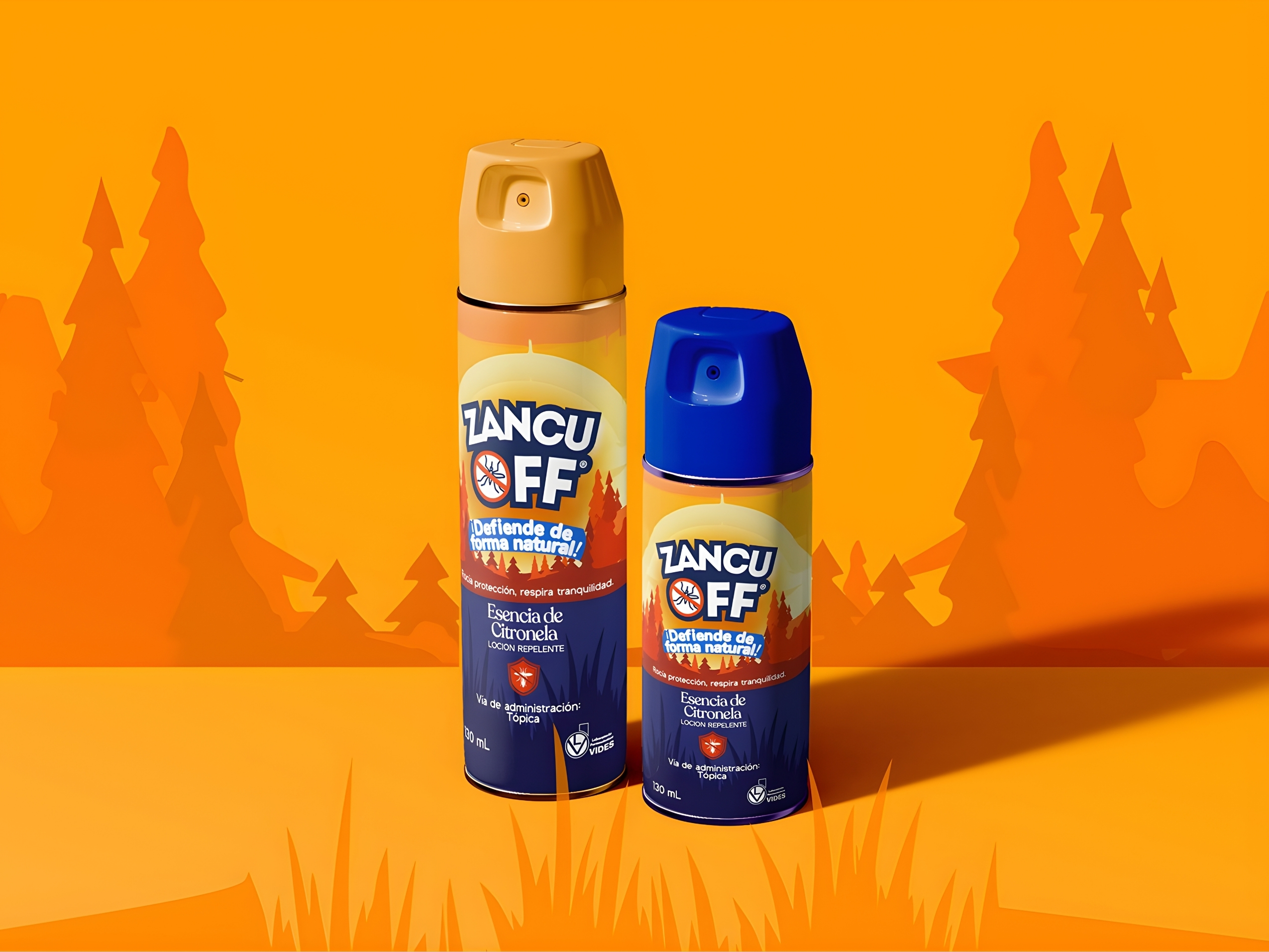
Zancu Off is a citronella-based repellent created to offer everyday protection through a more natural approach. Its identity translates that balance between effectiveness and ease into a clean, flexible visual system designed to work across packaging, communication materials, and real-life use.

Branding

_Branding web - Zancu Off (1)

(01)
ABOUT THE PROJECT

Designing natural protection with clarity and ease.

Zancu Off is a citronella-based repellent created around a lighter, more natural approach to everyday protection. The brand needed to feel fresh and approachable while still communicating reliability and function.

Our challenge was to translate that balance into an identity that could stand out in its category without relying on the heavy or overly technical visual codes often associated with repellents.

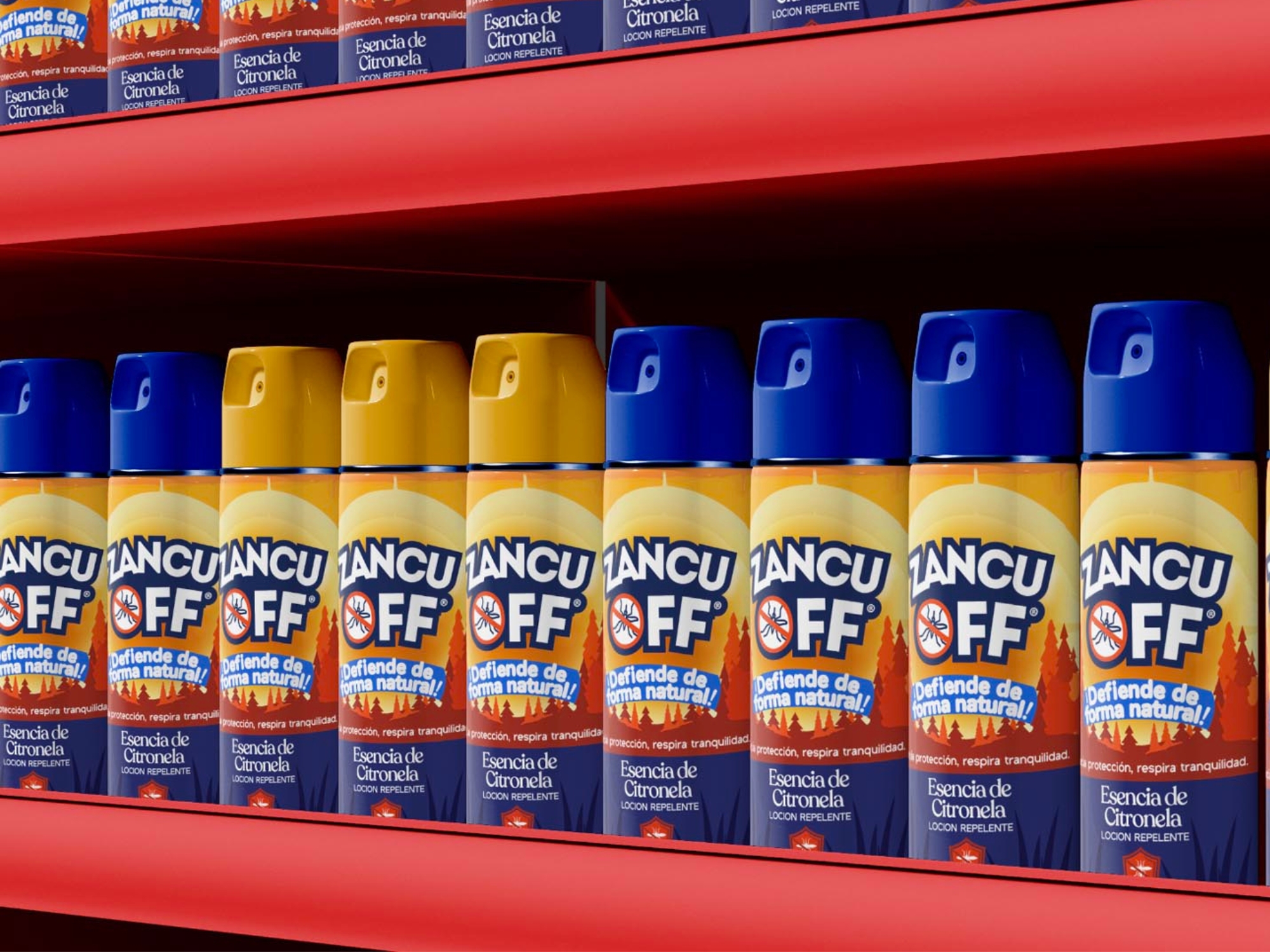
The visual direction combines clarity, freshness, and flexibility into a system designed to work naturally across packaging, communication materials, and everyday applications.

Zancu_Off-3
Zancu_Off-5
Zancu_Off-4
Zancu_Off-6

(02)
PROJECT GOALS

Make natural protection feel approachable and recognizable.

The goal was to create an identity that clearly communicates everyday protection without relying on harsh, overly technical, or aggressive visual codes. Zancu Off needed to feel fresh, trustworthy, and easy to recognize at a glance.

Build a system that works in real use.

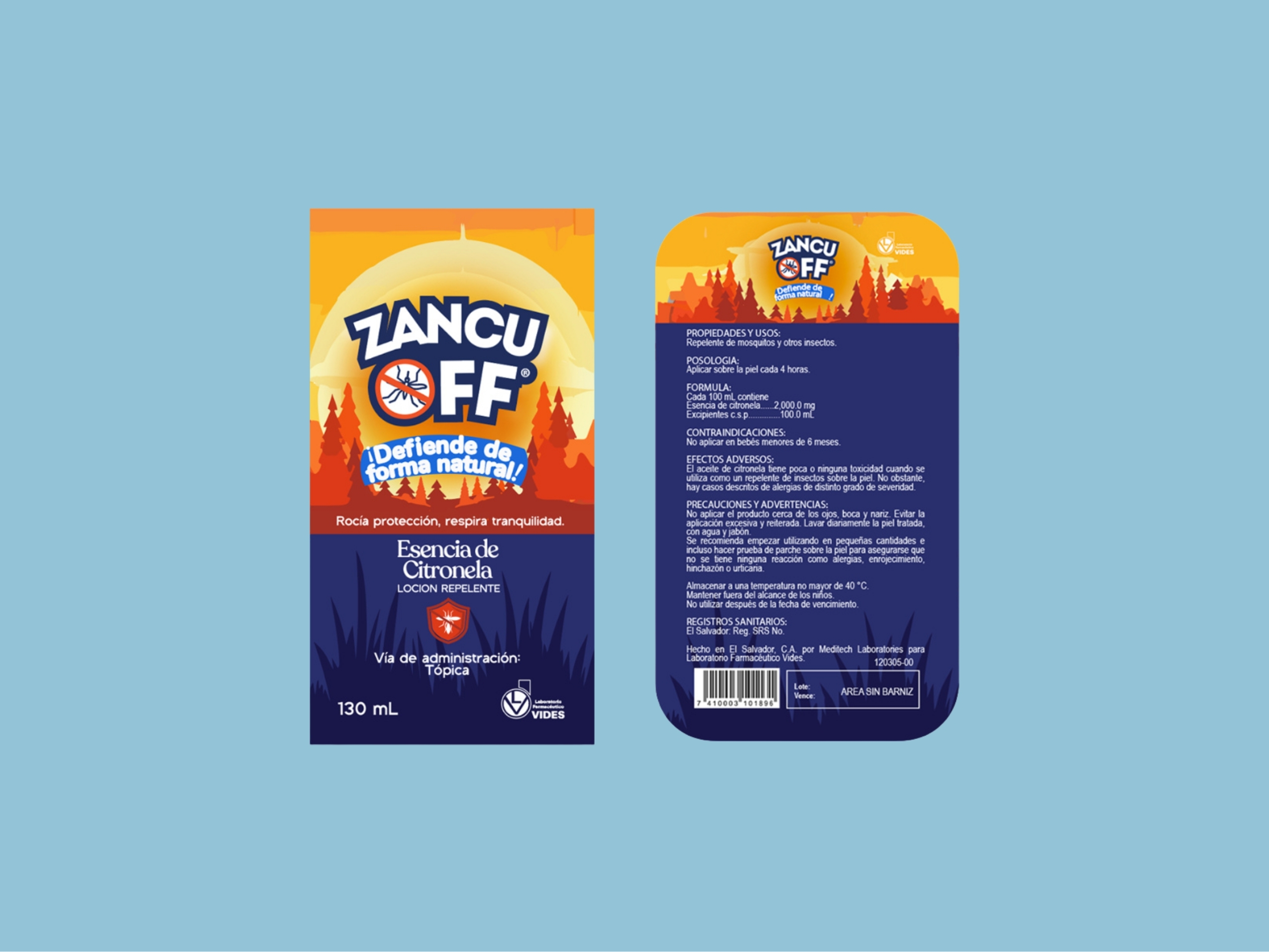
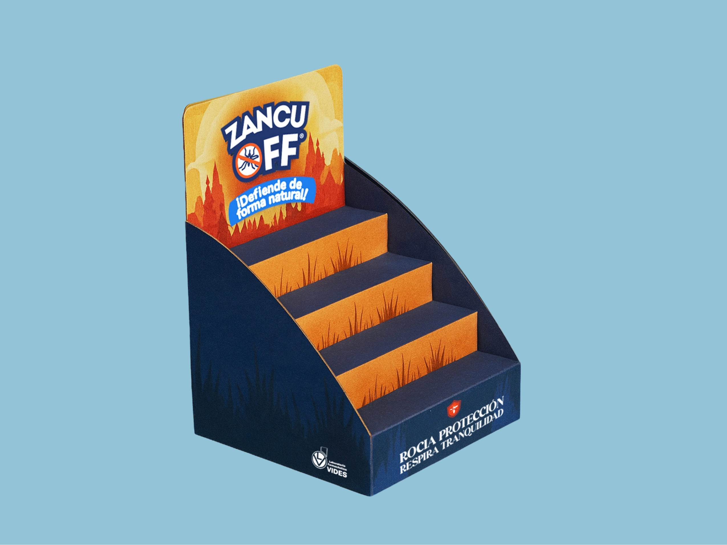
The identity needed to remain clear and adaptable across packaging, graphic elements, and different communication formats. Form, color, typography, and supporting visuals were developed to create consistency while keeping the brand light, functional, and easy to apply.

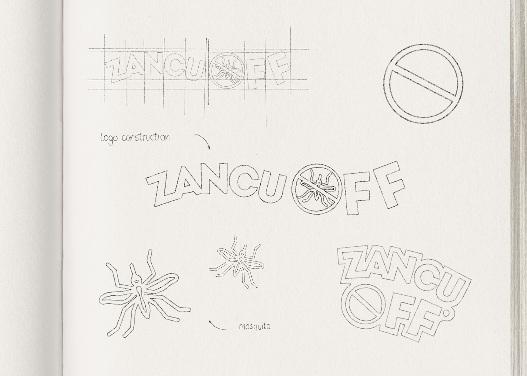
LOGO ZANCU OFF
_Branding web - Zancu Off (6)
ChatGPT Image 21 abr 2026, 08_03_43

(03)
PROJECT OUTCOME

Natural protection, built to work in everyday life.

Project Outcome

Zancu Off emerged with a clear and recognizable identity that gives a traditionally functional product a lighter, more approachable expression.

From the logo and color system to packaging and supporting graphics, each element works together to communicate freshness, reliability, and ease without relying on the aggressive visual language often associated with the category.

The result is a flexible brand foundation designed to remain consistent across products, formats, and future applications while preserving the simple, natural character that makes Zancu Off distinctive.


Zancu_Off-7-2

01. Why this visual direction?

Zancu Off needed to communicate protection without relying on the heavy, aggressive visual codes commonly associated with repellents. The identity was shaped to feel lighter, fresher, and more approachable while still communicating reliability and function.

02. What makes the brand system distinctive?

The system balances natural cues with clarity and practicality. Typography, color, curved forms, and supporting graphics work together to create a recognizable identity that feels fresh and accessible without losing the functional character of the product.

03. How does the identity translate into digital?

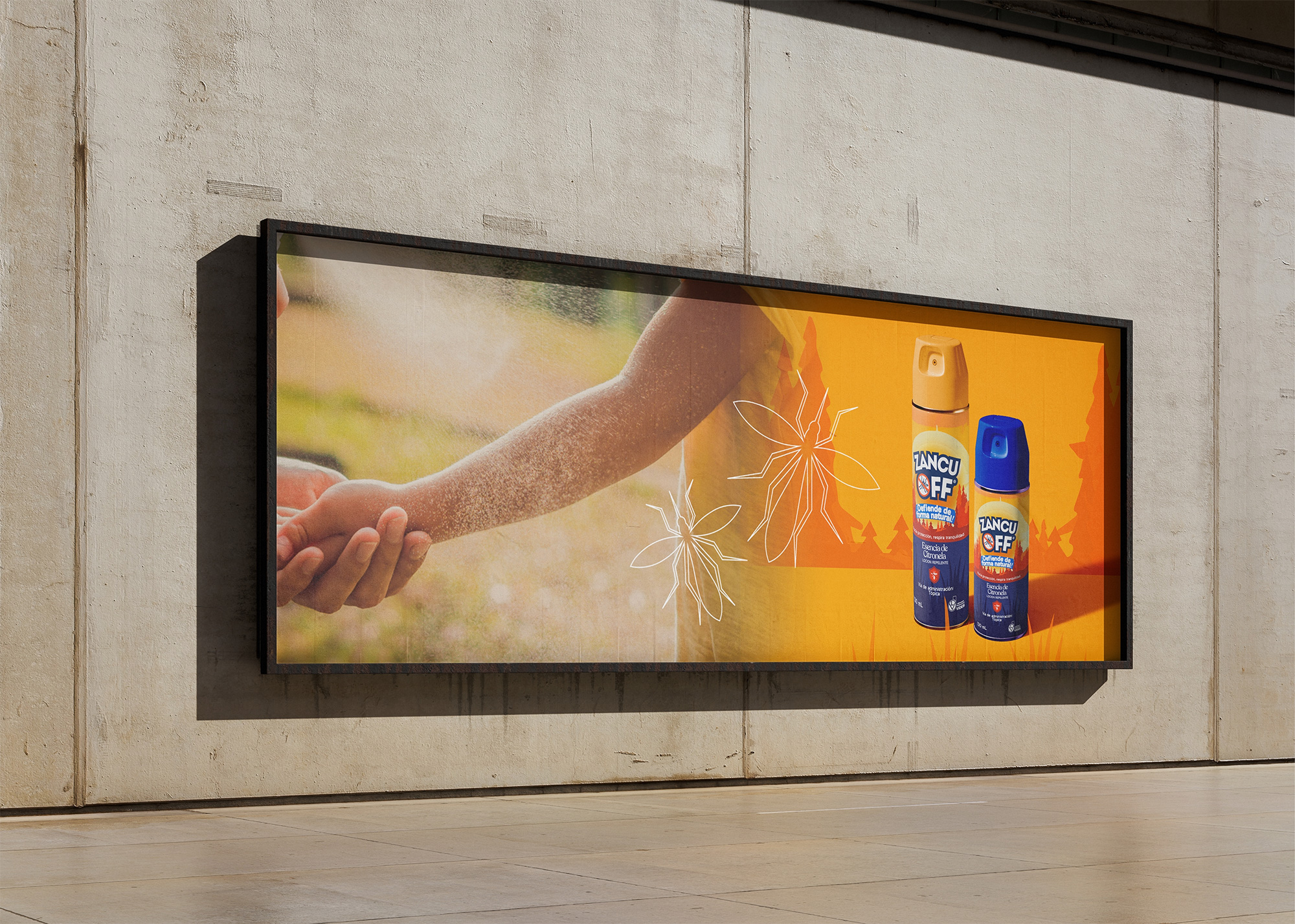
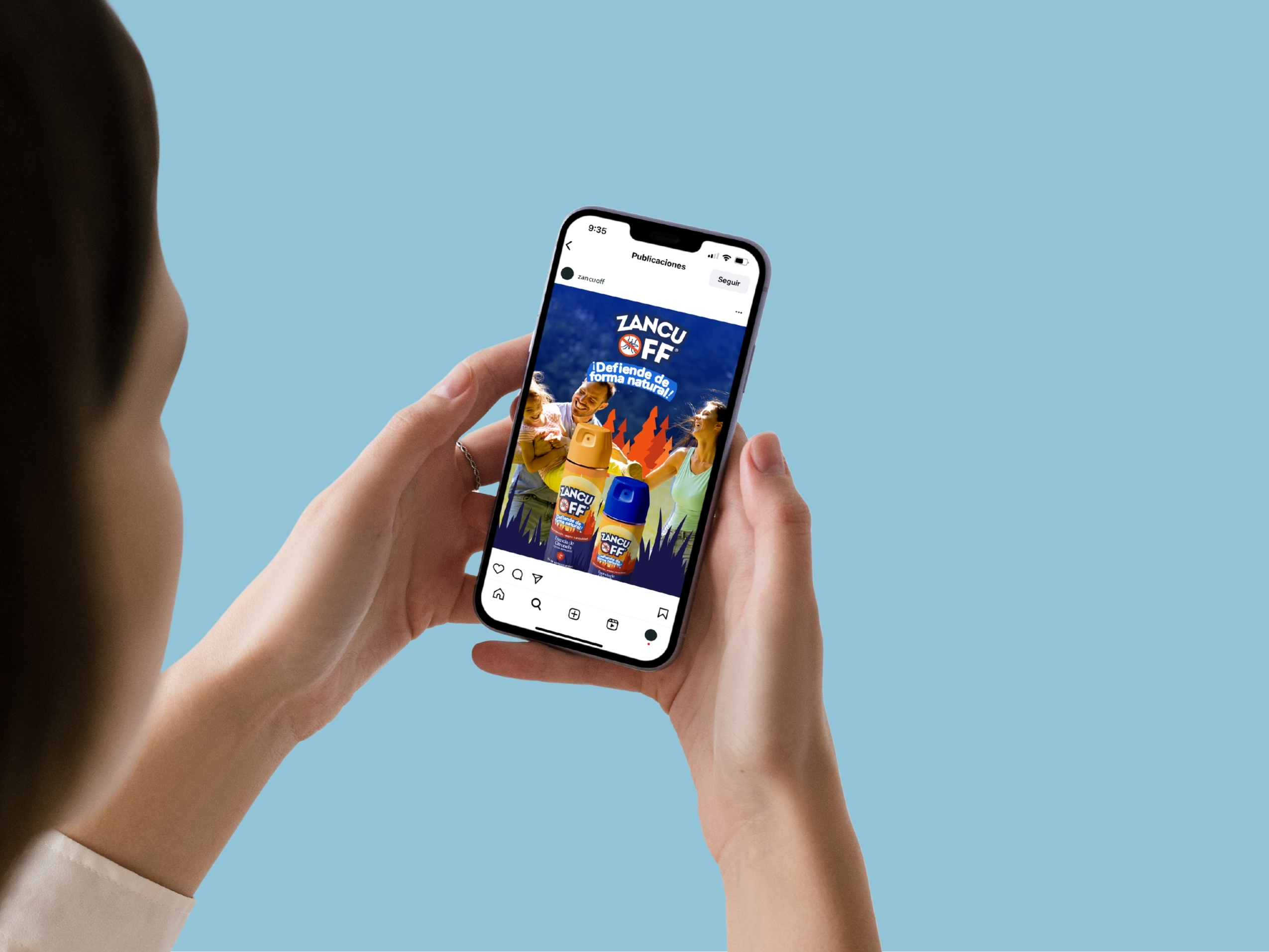
The visual system was designed to adapt naturally across social media, digital content, campaigns, and different communication formats. Consistent typography, graphic elements, and imagery help Zancu Off remain recognizable while giving the brand enough flexibility to create varied content.

04. How does photography extend the brand?

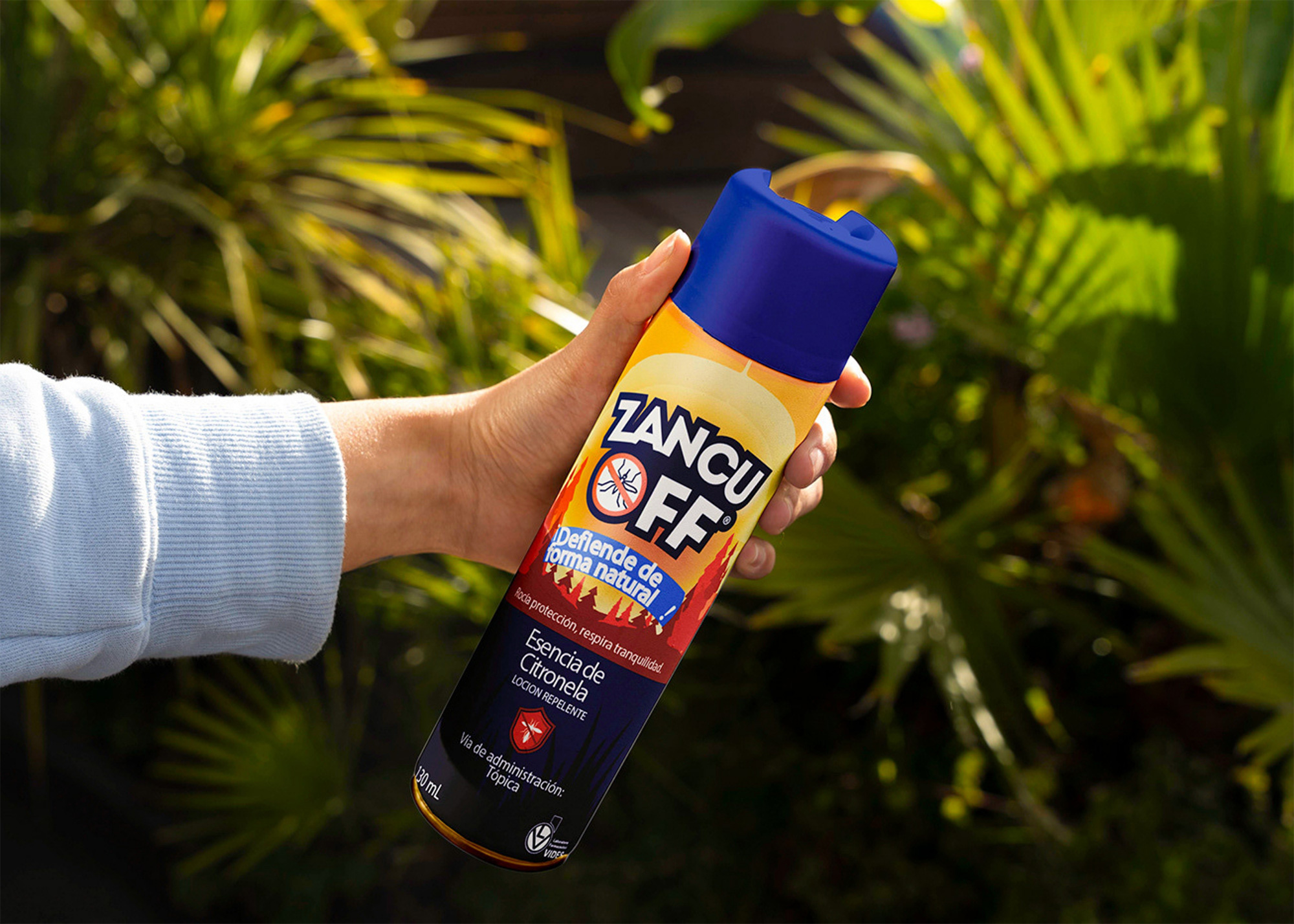
Photography brings the identity into real-life contexts, showing the product as part of everyday outdoor moments rather than in isolation. Natural environments, light, and human interaction reinforce the brand’s approachable character while creating imagery that can work across campaigns, social media, and digital applications.

Zancu Off was designed to protect without feeling harsh translating the lightness of its natural approach into a clear, gentle, and effective visual system.

NEXT PROJECT

The Veggie Straws

Photography