Nina’s Jewels

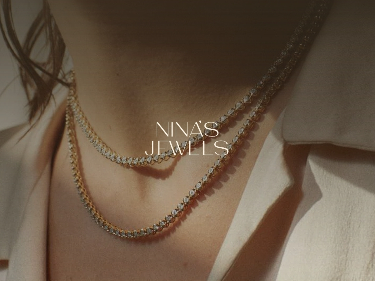
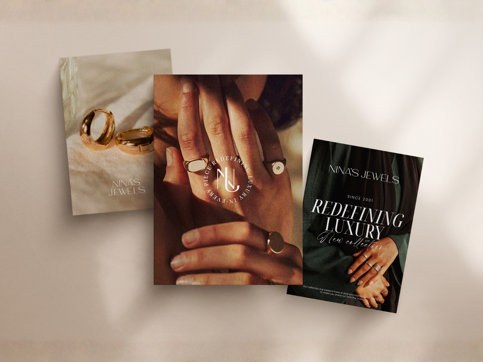
Jewelry is personal. The identity needed to feel the same. Nina’s Jewels was shaped around a refined visual language that balances elegance with personality — creating a brand presence that feels distinctive, contemporary, and closely connected to the pieces it represents.

Built to move beyond a single collection.
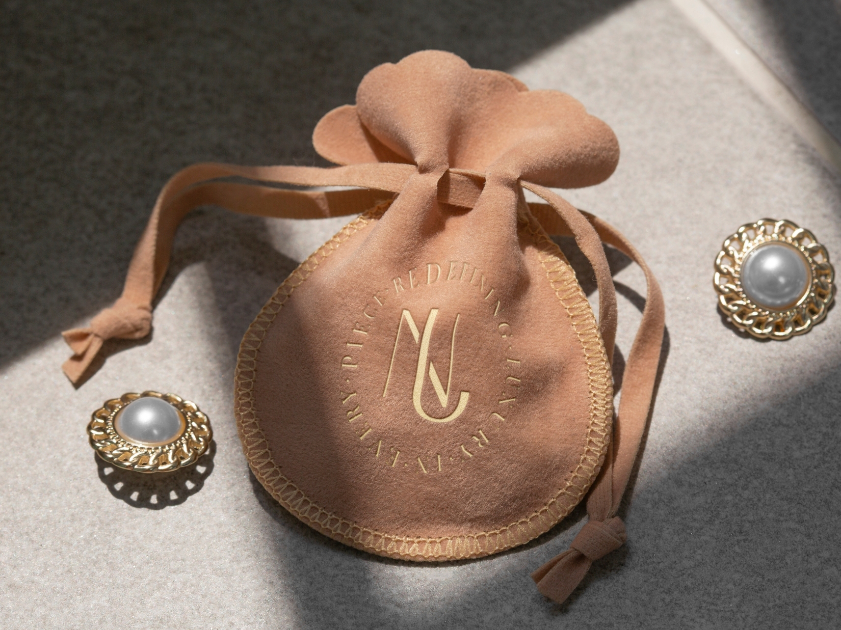
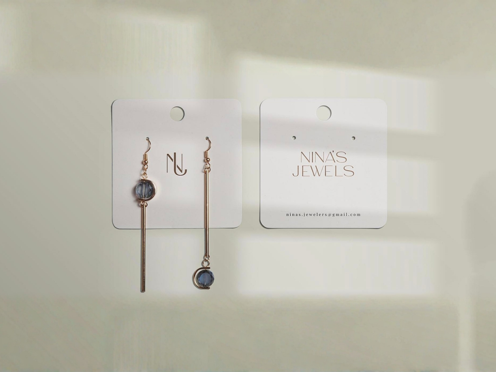
The identity was developed as a flexible system that can adapt across packaging, digital platforms, campaigns, and future collections while maintaining a consistent and recognizable character.

Branding

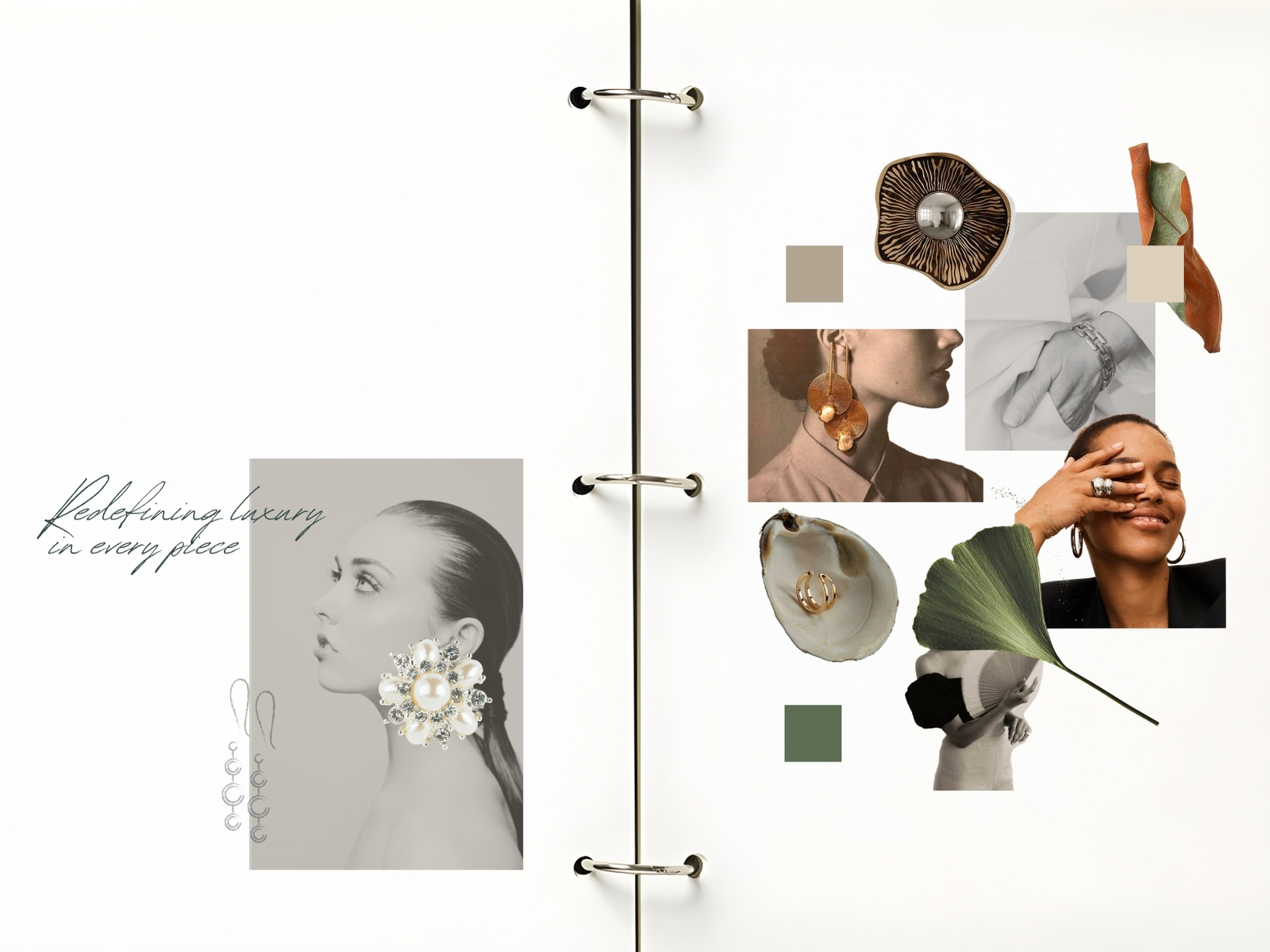
MOOD1

(01)
PROJECT OUTCOME

Redefining modern luxury through meaning and craft

Project Outcome

NINA’S JEWELS emerged with a refined and distinctive identity built around a more personal expression of luxury — one where detail, craftsmanship, and individuality take precedence over excess.

The visual system was designed to complement the jewelry rather than compete with it. Typography, composition, and a restrained graphic language create a confident framework that allows each piece and collection to remain at the center.

The result is a flexible brand foundation that can extend across packaging, digital platforms, campaigns, and future collections while preserving the elegance and character that make NINA’S JEWELS recognizable.


10
1
Branding web - Ninas (3)
nina-jewels-5

(02)
DESIGN INTENT

Designing trust into every detail.

NINA’S JEWELS needed an identity that could feel refined and desirable without becoming distant. The creative direction was built around balance — giving the jewelry enough space to lead while creating a visual world that feels considered, confident, and personal.

Typography, composition, spacing, and a restrained palette work together to create a sense of order and sophistication without unnecessary excess. Every element supports the product rather than competing for attention.

The result is an experience where the details feel as considered as the pieces themselves — creating a brand presence that feels distinctive, polished, and easy to recognize.

9

(03)
PROJECT GOALS

Create a more personal relationship with the brand.

The identity needed to communicate the care, craftsmanship, and detail behind each piece while making the overall experience feel more personal and considered.

Rather than treating jewelry as a purely transactional purchase, the goal was to create a brand world that gives each collection more context, emotion, and meaning.

Balance exclusivity with approachability.

NINA’S JEWELS needed to feel refined and desirable without becoming distant or overly formal. The visual language was designed to preserve a sense of sophistication while remaining warm, contemporary, and easy to connect with.

01. Why this logo design?

The logo was designed to reflect the balance between refinement and simplicity that defines NINA’S JEWELS. Clean typography, careful spacing, and a restrained visual language give the identity a contemporary presence without competing with the jewelry itself.

Its simplicity also makes the mark versatile enough to move across packaging, digital platforms, campaigns, and future collections while remaining clear and recognizable.

02. What makes NINA’S JEWELS distinctive?

The identity was built around a quieter expression of luxury — one that relies on detail, proportion, and restraint rather than excess.

Beyond the logo, typography, composition, imagery, and supporting elements work together as one system, giving every collection room to feel different while remaining unmistakably part of NINA’S JEWELS.

03. How does the brand translate into digital?

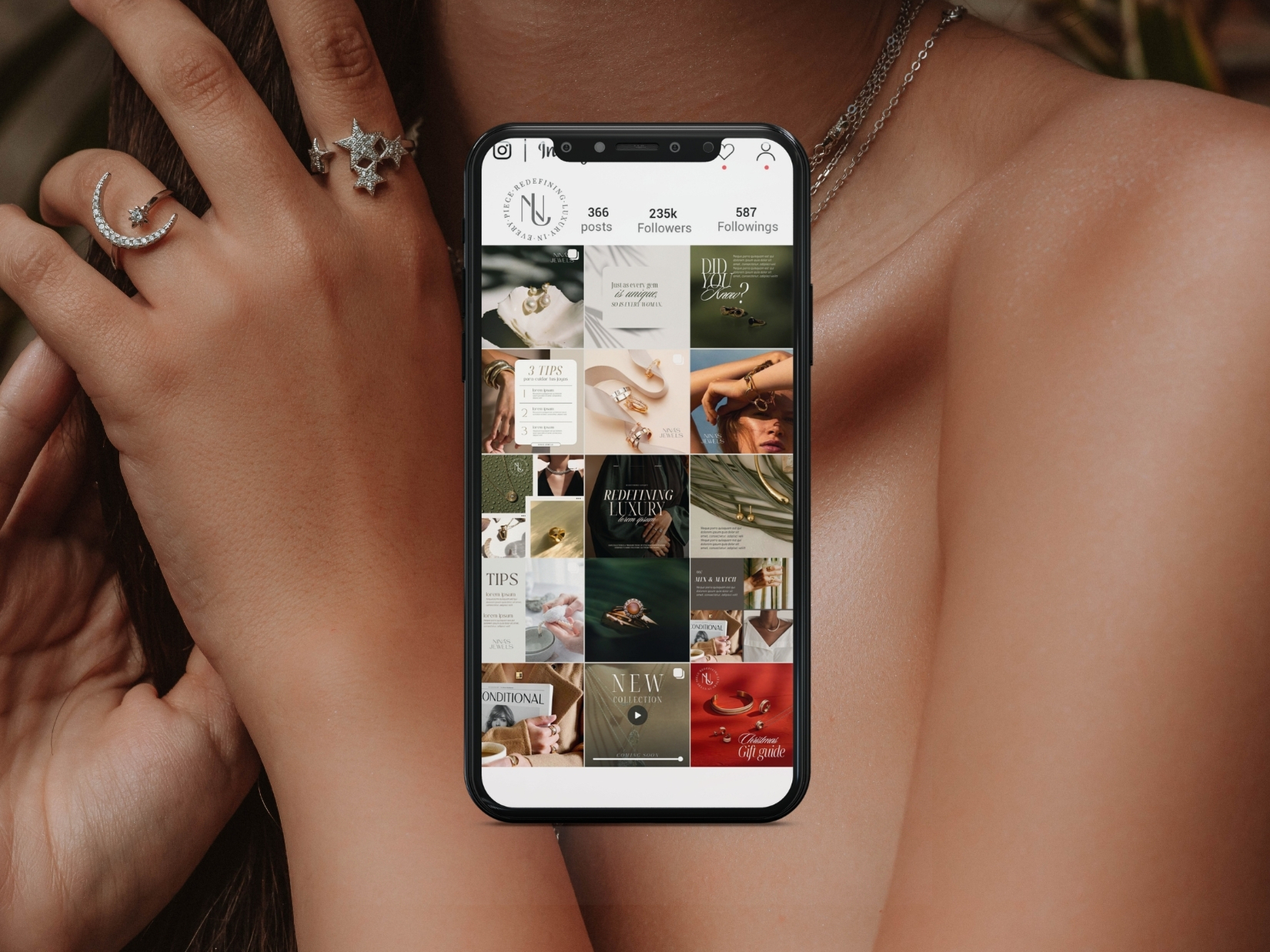
The visual system was designed to move naturally into digital environments, where the jewelry remains the focal point. Clear hierarchy, generous space, and consistent typography create an experience that feels refined without becoming visually heavy.

This gives NINA’S JEWELS a recognizable digital presence that can adapt across websites, social media, campaigns, and different content formats while preserving the same character.

04. Why choose our branding approach?

Our approach goes beyond creating a logo we build complete visual systems that define how a brand looks, feels, and communicates. For Nina’s Jewels, this meant crafting an identity that is timeless, versatile, and deeply connected to its essence.

The result is a strong and adaptable brand foundation that supports growth, consistency, and long-term relevance.

(03).
PROJECT OUTCOME

A clearer, more distinctive foundation for the brand.

NINA’S JEWELS now has a visual identity that feels refined, recognizable, and consistent across its different touchpoints. The system gives the brand a stronger sense of character while allowing the jewelry itself to remain at the center.

Built to extend beyond the logo, the identity can adapt across packaging, digital platforms, campaigns, and future collections without losing its visual coherence.

The result is a flexible foundation that gives NINA’S JEWELS room to evolve while preserving the elegance, restraint, and personality that define the brand.

7
6
3

NEXT PROJECT

Rodner Figueroa

Branding