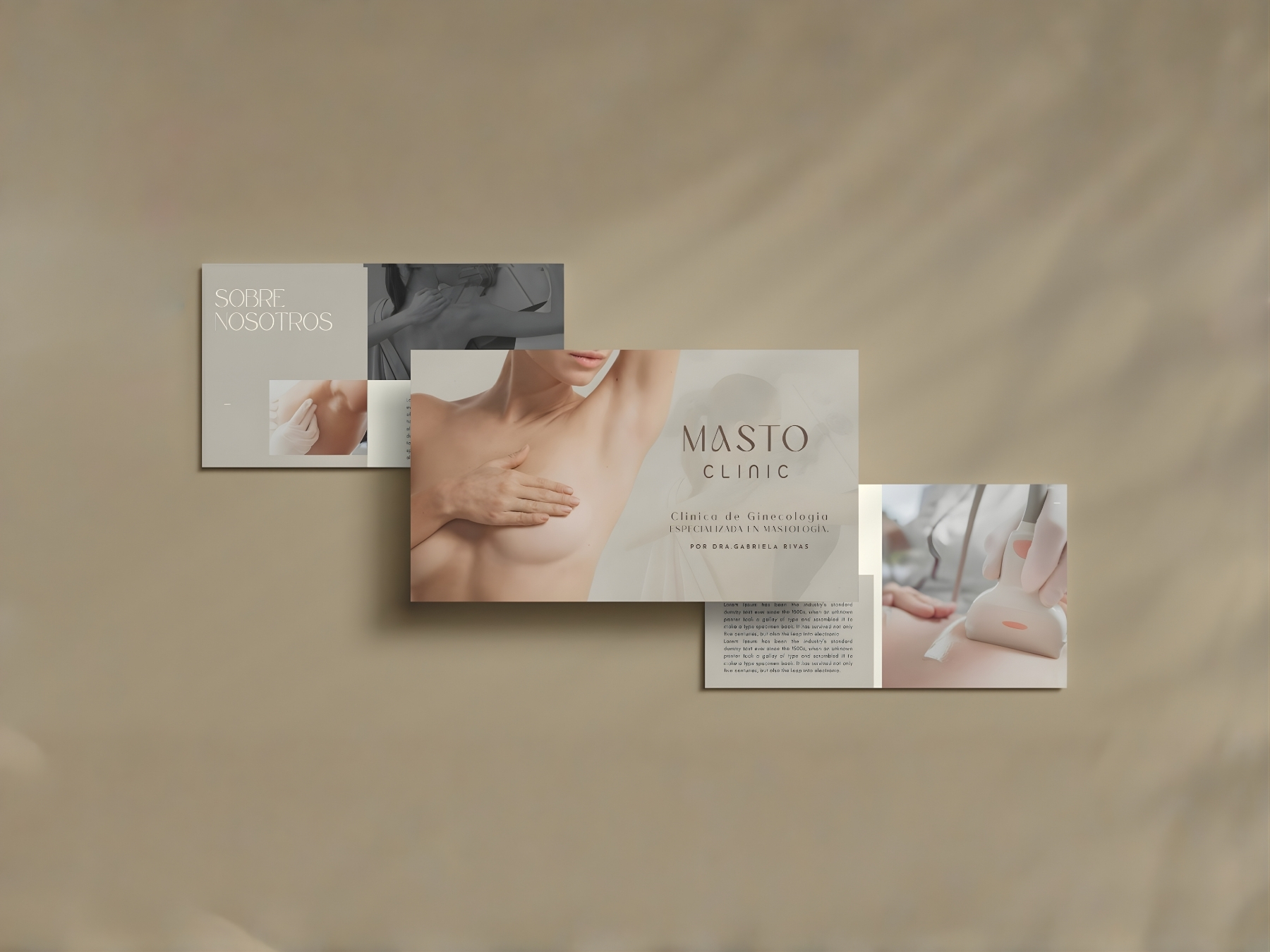
Masto Clinic

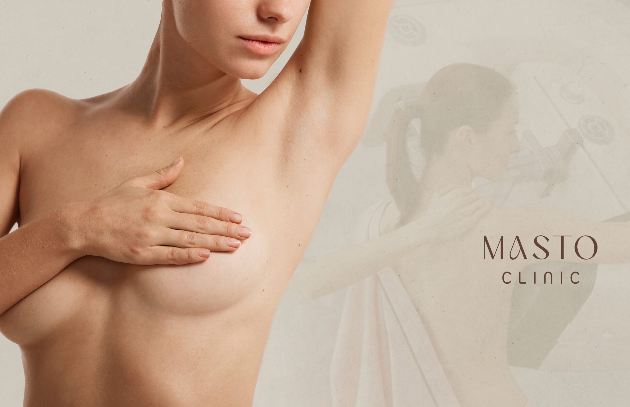
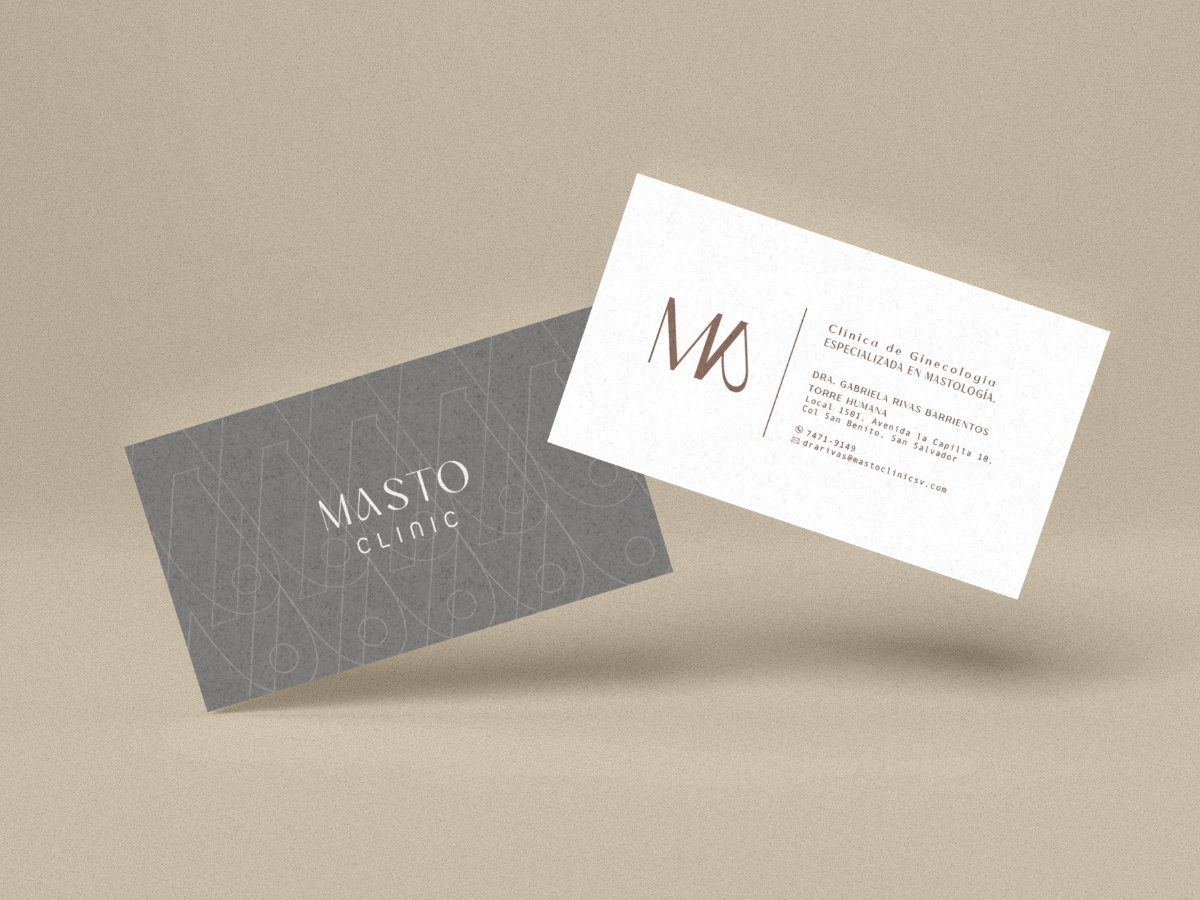
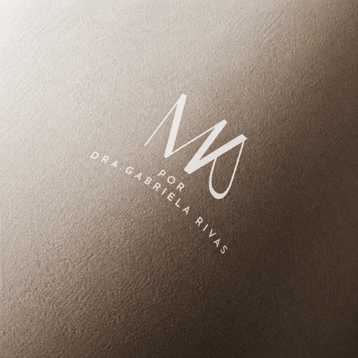
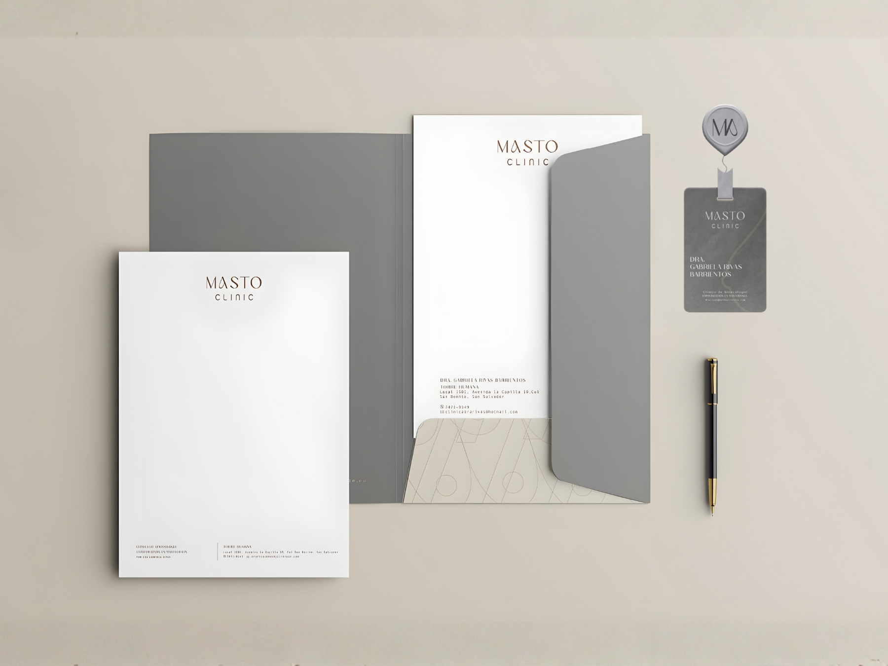
Masto Clinic’s identity balances clinical precision with a softer, more human expression. Clean forms and subtle curves create a visual language that feels calm, considered, and reassuring, reflecting a specialized approach to care centered on trust and sensitivity.

Branding

5
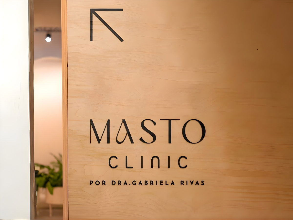
FACHADDA MASTO 2
masto folder
MASTO CARDS

(01).
IMPACT

A clearer, more reassuring presence for a highly specialized field.

The new identity gives Masto Clinic a visual language that feels professional without becoming cold or distant. By balancing clinical precision with a softer expression, the brand communicates trust, sensitivity, and specialized care more naturally.

The result is a more distinctive and consistent presence one that supports the clinic’s expertise while creating a calmer, more approachable experience across every touchpoint.

01. How do we build meaningful brands?

We begin by understanding what the brand needs to communicate, who it needs to reach, and how it should be perceived. For Masto Clinic, that meant balancing medical expertise with sensitivity, trust, and a more human approach to care.

That understanding became the foundation for an identity that feels clear, reassuring, and built to remain relevant as the clinic evolves.

02. How do we translate strategy into design?

Strategy became a series of visual decisions. Typography, form, proportion, color, and composition were developed to balance clinical precision with a softer and more approachable expression.

Rather than treating each element independently, we built a visual system where every choice reinforces the same idea: specialized care communicated with clarity, sensitivity, and confidence.

03. How do we create digital experiences that connect?

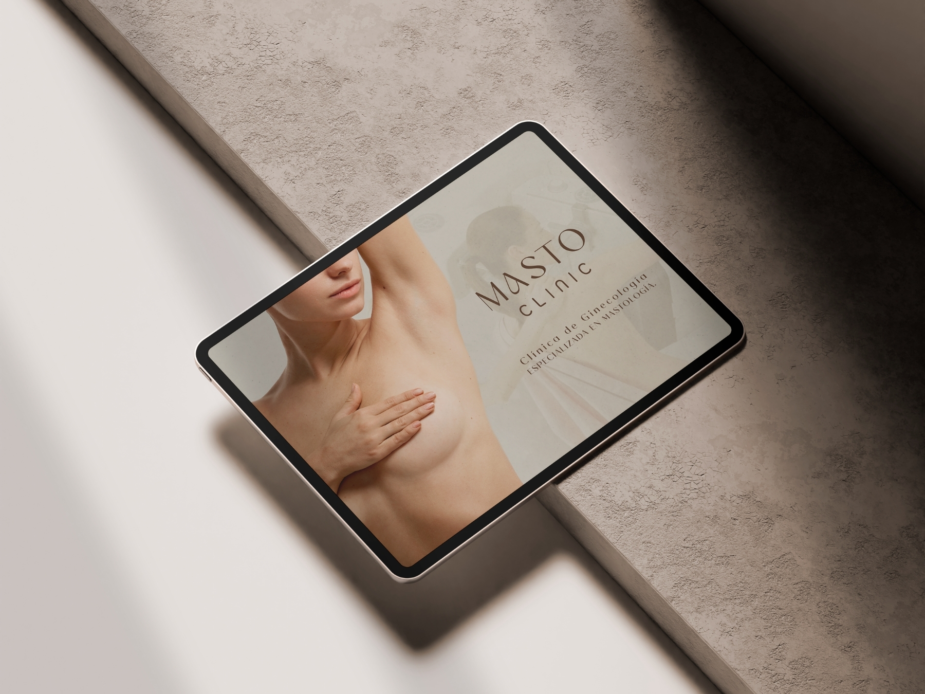
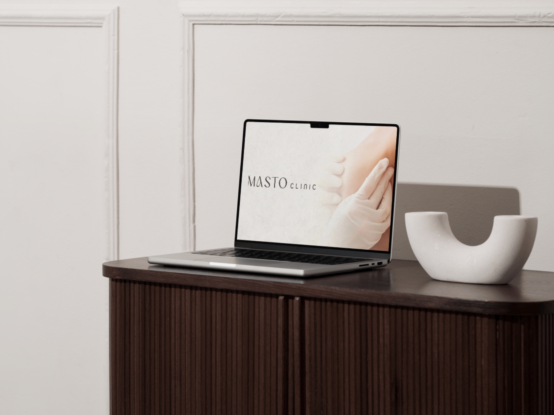
For Masto Clinic, the digital experience needed to feel just as clear and reassuring as the identity itself. We translated the visual system into intuitive layouts, thoughtful hierarchy, and a calm flow that helps information feel accessible rather than overwhelming.

Every interaction was designed to preserve the same balance between medical precision and human sensitivity established throughout the brand.

04. How do we build a brand that can evolve?

The identity was designed as a flexible system rather than a fixed set of applications. Clear visual principles allow Masto Clinic to maintain a recognizable presence across digital, print, communication materials, and future touchpoints.

This gives the brand room to adapt and grow without losing the consistency, sensitivity, and professional character at its core.

11
7

(02)
PROJECT GOALS

Build trust through clarity.

The primary goal was to translate Masto Clinic’s specialized medical expertise into an identity that feels clear, professional, and reassuring. The brand needed to communicate authority without feeling clinical or distant, creating a more approachable expression of care.

Create a system built to evolve.

Beyond the core identity, the goal was to establish a flexible visual system that could remain recognizable across digital, print, patient communications, and future applications — giving Masto Clinic consistency today and room to grow over time.

13
14
12

Design Philosophy

Design as a deliberate act

Creative Direction

Every decision was made to balance medical precision with a more human expression. From typography and structure to tone, spacing, and visual rhythm, the identity was shaped to communicate expertise without feeling cold or overly clinical.

Rather than designing for a single moment, we built a system for real use — clear, adaptable, and consistent across the clinic’s different communications and touchpoints.

The result is a brand that feels calm, confident, and reassuring, with the flexibility to evolve alongside Masto Clinic.


NEXT PROJECT

Aldea

Branding